
Data Plots & Best-Fit Curves
Use ListPlot to visualize data as a scatterplot:
| In[1]:= |
| Out[1]= | 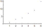 |
Or display information as a chart:
| In[2]:= |
| Out[2]= | 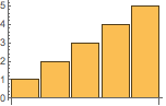 |
There are also specialized functions for time series, financial data and much more.
Multiple datasets are automatically colored differently:
| In[1]:= |
| Out[1]= |  |
You can change the style and appearance of plots using options like PlotTheme.
Find a curve of best fit with the Fit command:
({1,x,x2} means a quadratic fit over x.)| In[1]:= |
| Out[1]= |
Use Show to compare the curve with its data points:
| In[2]:= |
| Out[2]= | 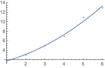 |
QUICK REFERENCE: Data Visualization »
QUICK REFERENCE: Curve Fitting & Approximate Functions »