Wolfram
Mathematica
8의 신기능: 통계의 시각화
◄
이전
|
다음
►
그래픽 및 시각화
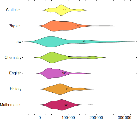
대학의 급여 비교
대학 일부 학과의 급여 분포를 학과의 크기로 분류하여 비교한 것입니다.
In[1]:=
X
salaries = ExampleData[{"Statistics", "UniversitySalaries"}, "DataElements"]; depts = {"Mathematics", "History", "English", "Chemistry", "Law", "Physics", "Statistics"}; salaries = Table[Cases[salaries, {d, _, salary_, "A"} :> salary], {d, depts}];
In[2]:=
X
DistributionChart[salaries, ChartLabels -> Placed[{depts, Length /@ salaries}, {Axis, Center}], ChartStyle -> 54, BarOrigin -> Left, AspectRatio -> 1, LabelStyle -> {FontSize -> 16}, ImageSize -> 575, BaseStyle -> {FontFamily -> "Helvetica"}, LabelStyle -> Bold]
Out[2]=