| 24 | More Forms of Visualization |
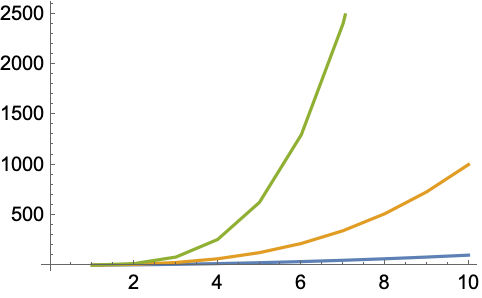
We’ve seen how to plot lists of data with ListPlot and ListLinePlot. If you want to plot several sets of data at the same time, you just have to give them in a list.
Plot two sets of data at the same time:
In[1]:=
Out[1]=

The PlotStyle option lets you specify the style for each set of data:
In[2]:=
Out[2]=

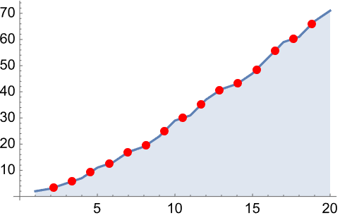
The Mesh option lets you show the actual data points too:
In[3]:=
Out[3]=

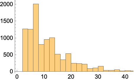
As well as looking at the sequence of values in a list, it’s also very common to want to see how often different values occur. You can do this with Histogram.
Here are the lengths of the first 30 common English words:
In[4]:=
Out[4]=
In[5]:=
Out[5]=

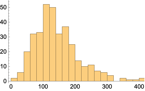
Including all the words gives a smoother result:
In[6]:=
Out[6]=

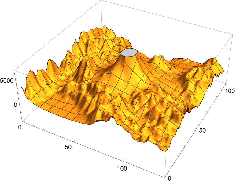
Sometimes you’ll have data you want to visualize in 3D. For example, GeoElevationData can give an array of height values. ListPlot3D makes a 3D plot.
Find an array of height values around Mount Everest, and plot it in 3D:
In[7]:=
Out[7]=

Show it without a mesh:
In[8]:=
Out[8]=

An alternative visualization is a contour plot, in which one’s effectively looking from above, and drawing contour lines at evenly spaced heights.
Make a contour plot, in which successive ranges of heights are separated by contour lines:
In[9]:=
Out[9]=

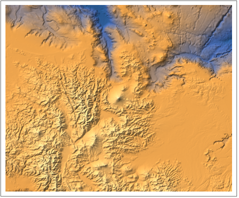
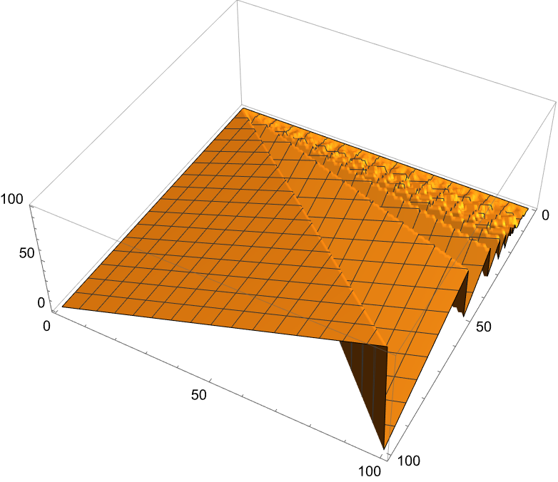
When one’s dealing with large amounts of data, it’s often better to use a simpler visualization, such as a relief plot, that essentially just colors according to height.
Make a relief plot of the topography 100 miles around Mount Everest:
In[10]:=
Out[10]=

| ListLinePlot[{list1,list2,...}] | plot several lists together | |
| Histogram[list] | make a histogram | |
| ListPlot3D[array] | plot an array of heights in 3D | |
| ListContourPlot[array] | plot contours for an array of heights | |
| ReliefPlot[array] | make a relief plot | |
| GeoElevationData[region] | array of geo elevations for a region | |
| PlotStyle | option for styling each set of data | |
| Mesh | whether to have a mesh of points or lines | |
| MeshStyle | option for styling a mesh |
24.1Make a plot with lines joining the squares, the cubes and the 4th powers of integers up to 10. »

24.2Make a plot of the first 20 primes, joined by a line, filled to the axis and with a red dot at each prime. »
24.3Make a 3D plot of the topography for 20 miles around Mount Fuji. »
24.4Make a relief plot of the topography for 100 miles around Mount Fuji. »
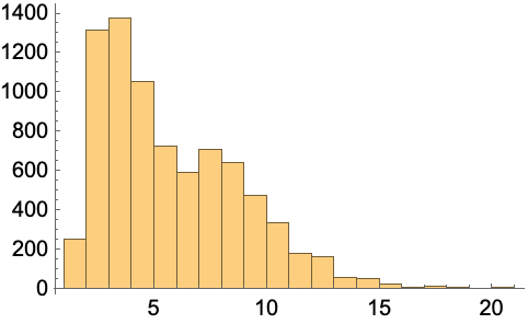
24.6Make a histogram of the differences between successive primes for the first 10000 primes. »
24.7Make a histogram of the first digits of squares of integers up to 10000 (illustrating Benford’s law). »
24.8Make a histogram of the length of Roman numerals up to 1000. »
24.9Make a histogram of sentence lengths in the Wikipedia article on computers. »
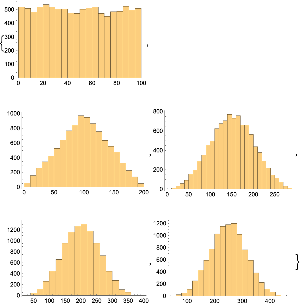
24.10Make a list of histograms of 10000 instances of totals of n random reals up to 100, with n going from 1 to 5 (illustrating the central limit theorem). »
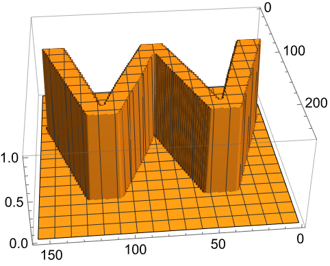
24.11Generate a 3D list plot using the image data from a binarized size-200 letter “W” as heights. »
+24.1Make a histogram of word lengths in the Wikipedia article on computers. »
What other kinds of visualizations are there?
Lots. Like StackedListPlot and ListStepPlot, or BubbleChart and BarChart3D, or SmoothHistogram and BoxWhiskerChart, or AngularGauge and VerticalGauge.
How do I combine plots I’ve generated separately?
Use Show to combine them on common axes. Use GraphicsGrid, etc. (see Section 37) to put them side by side.
How can I specify the bins to use in a histogram?
Histogram[list, n] uses n bins. Histogram[list, {xmin, xmax, dx}] uses bins from xmin to xmax in steps dx.
What’s the difference between a bar chart and a histogram?
A bar chart is a direct representation of data; a histogram represents the frequency with which data occurs. In a bar chart, the height of each bar gives the value of a single piece of data. In a histogram, the height of each bar gives the total number of pieces of data that occur within the x range of the bar.
How can I draw contour lines on a 3D topography plot?
Use MeshFunctions(#3&). The (#3&) is a pure function (see Section 26) that uses the third (z) coordinate to make a mesh.
How do I label heights in a contour plot?
Use ContourLabelsAll.
- The Wolfram Language makes many automatic choices for visualization functions. You can override these choices using options.
- An alternative to using PlotStyle is to insert Style directly into the data given to functions like ListLinePlot.
- At least over much of the Earth, GeoElevationData has data measurements down to a resolution of about 40 meters. It’s also available for the Moon, Mars, Mercury, etc.