Let’s now explore the task of regression, which is probably the second-most classic task of machine learning. In machine learning, regression is a supervised learning task for which the goal is to predict a numeric value (a number, a quantity, etc.). Regression is very similar to classification; it only differs in the type of the predicted variable. A large number of problems can be formulated as a regression problem: predicting prices, population sizes, traffic, and so on. This task will be introduced through the training and use of regression models.
Car Stopping Distances
Let’s start by loading a simple dataset that consists of (old) car stopping distances as function of their speed:
This dataset contains 50 examples that we can visualize in a scatter plot:
Each example is a recording of the speed of the car and its stopping distance. Since both values are numeric, we could train a regression model to predict any of them. Let’s train a model to predict the stopping distance for a given speed. We can prepare the dataset as input-output pairs and give it to the function Predict, which works similarly to the function Classify:
Predict used this data to create a regression model. We can give a new speed input to this model to obtain a prediction for the stopping distance. For example, a car driving at a speed of 23 miles per hour is predicted to stop after 72 feet:
Let’s visualize the predictions of the model along with the training data:
As we can see, the model is pretty simple here. It is just a line. One thing to notice is that the prediction curve does not cross every point. This can be a sign that the model is not powerful enough, but it can also be normal since the goal of machine learning is to generalize to new data and not to fit the training data perfectly (see Chapter 5, How It Works). In this case, it is clear that most of the deviations from the predictions cannot be predicted; they are noise (note that with more information about each example, it might be possible to predict all of these deviations, and we would not consider them noise anymore). Because these deviations are unpredictable, it would actually be harmful to have a model predicting every training example perfectly. It would be a case of overfitting (see Chapter 5). Overall, this simple model seems to give decent predictions.
Like classifiers, most regression models are probabilistic, which means that they can express their prediction beliefs in terms of probabilities. Since the output of regression models is a number, this belief is represented by a continuous probability distribution called the predictive distribution. Let’s compute this predictive distribution for a speed of 23 miles/hour:
This is a normal distribution (a.k.a. Gaussian distribution) centered at 72 feet and with a standard deviation of 15 feet. Let’s visualize its probability density:
We can see that while the most likely stopping distance is 72 feet, distances in the 50–100 feet range are also plausible outcomes (the area under the distribution curve corresponds to a probability). An interval of plausible values is called a confidence interval. For example, a 68% confidence interval means that the model believes that there is a 68% chance for the real distance to lie within this interval.
Let’s visualize this 68% confidence interval on a prediction plot, which corresponds to one standard deviation around the mean:
As you can see, only about a third of the examples are outside the confidence interval, so the uncertainty provided by the model looks sensible (although one should confirm this using test data). One thing to notice is that the uncertainty is the same for every prediction. This is generally what regression models do: they return a constant uncertainty value that does not depend on the input. In statistical terms, this is called homoscedastic noise. Returning a constant uncertainty is not a requirement though. Some models return variable (and often better) uncertainty estimates, such as the Gaussian process method (see Chapter 10, Classic Supervised Learning Methods). Variable noise is called heteroscedastic.
The other thing to notice is that the distribution is unimodal, which means it has only one peak, as opposed to a multimodal distribution such as:
It is very common for regression models to only output unimodal distributions (and usually, it is a normal distribution). In most cases, it is fine, but in some cases, one might want to return more complex distributions. One simple way to do so is to treat the problem as a classification task instead. Indeed, in this example, we chose to frame the problem as a regression, but we could have framed it as a classification by grouping distance values into classes such as “low,” “medium,” and “high,” which is called discretizing a variable (see Chapter 9, Data Preprocessing). Here is an example of a classifier that predicts a discretized numeric quantity (the age of a person as an integer):
We can see that the predicted distribution is discrete. The drawback of this technique is that relations between values are lost in the data (such as “high” > “medium” > “low”). Ordinal regression (a.k.a. ordinal classification) can be used to solve this problem. This type of regression is like a classification but with the ordering between classes taken into account, a sort of regression/classification hybrid. Ordinal regression is not so much used in practice though.
Brain Weights
Let’s now use another simple dataset that consists of body and brain weights for various animals:
Let’s try to predict the brain weight as function of the body weight. We first extract these variables and visualize the data:
We cannot see much in this plot because some animals are gigantic, and this squishes small animals near the origin. Since all weights are positive and they span several orders of magnitude, it is probably a good idea to use a log-scale instead:
Such a transformation is good for visualization but is also good for making predictions since most models would have trouble handling data that spans several orders of magnitude. Let’s extract the values of each example and log transform them (see Chapter 9, Data Preprocessing):
Transforming the variable to predict (the brain weight) in this way also implicitly tells our machine learning model that we are more interested in predictions that are correct up to a percentage of the true value rather than up to a finite deviation.
Okay, so let’s now train a regression model on this data. An automatic function would work fine here, but instead, let’s use a neural network. Since we are not dealing with image, text, or audio data, we are not using a pre-trained network this time. Instead, we construct a network from scratch:
This network is a simple chain of layers, with three linear transformations and two nonlinearities. The learnable parameters of the model are inside the linear layers (see Chapter 5, How It Works, and Chapter 11, Deep Learning Methods). Let’s train this network:
The network is trained. Since we performed preprocessing, we need to include it in the model. For the input, we just need to apply a log function, and for the output, we need do the inverse operation, which means applying an exponential:
This is an important point: whatever processing we do, we need to include it in the model. This can sometimes be forgotten if the preprocessing doesn’t change things much (such as just changing the color balance of images) and can lead to suboptimal performance.
Let’s see the predictions of this model:
We can see that the model is a bit more complex than just a line this time. It wiggles and follows deviations a bit better. It is not clear if something simpler or more complex would work better here. Chapter 5 explains how to adapt the complexity of models to obtain better predictions.
Boston Homes
Let’s now create a regression model using a dataset that has more examples and more features. We choose the classic Boston Homes dataset, which consists of statistics about Boston suburbs in 1978. The goal is to predict the median home price in a particular suburb. Let’s first load the dataset:
This dataset has 506 examples and 14 variables. We first analyze the variable that we want to predict, "MEDV", which corresponds to the median value of prices in the suburb:
As expected, prices are positive and in a similar range, so we don’t need to use any preprocessing. Let’s look at the 13 features. All of them except the "CHAS" feature are numeric. The values of the "CHAS" feature are strings, so it could be a textual feature, but if we look closer we see that it only takes two values:
Furthermore, we can see that these values indicate if the tract bounds the Charles River or not. This feature is, therefore, categorical (it could also be considered Boolean).
We should perform other analyses to see if the data makes sense, but let’s skip it and directly train a regression model on this dataset. We first separate the dataset into a training set and a test set:
We now use the Predict function on this training set and indicate that "MEDV" is the variable to predict. We also specify that the training should take about 10 seconds (this allows the automatic procedure to explore more models), and finally, we specify that the feature type for "CHAS" is nominal because it would not be correctly interpreted otherwise:
We now have a trained regression model. Let’s first visualize some information about it:
We can see things like the memory size of the model, the speed at which it can predict examples, an estimation of its prediction abilities, and a learning curve. Here the learning curve shows the root mean squared error (RMSE) (see the Regression Measures section in this chapter). Since the curve is still going down at the end, we would most likely benefit from using more training data.
We should check if the features have been correctly interpreted:
Everything seems correct. We can now use this regression model to predict the price of a home in an imaginary suburb:
We can obtain the uncertainty of this prediction by obtaining the predictive distribution:
This means that the uncertainty of this prediction is about 2.7.
We can also obtain some kind of feature importance by computing SHAP values, as we saw in Chapter 3, Classification:
Here we can see that the average number of rooms (feature "RM") is responsible for a price change of 10.16, which is by far the most important contribution. We can confirm the importance of this feature by visualizing how the average number of rooms is changing the price prediction for this particular example:
Prices are going up with the average number of rooms. This makes sense. However, there is something very important to understand about the model we just created: it is not a causal model. As a consequence, we cannot conclude that a variable is causing the price to change in a given direction. To convince ourselves, let’s predict housing prices using the crime rate only:
Let’s now plot the predictions of this model as function of the crime rate:
We can see that the price is dropping overall, but it is also rising for a range of values. Obviously, a higher crime rate is never causing a higher price. Instead, crime can be correlated with some other features (e.g. how central the suburb is) that are themselves causing a higher price, so it should be stressed that these models (including classifiers) are not really meant to make causal predictions but only to predict the target variable. In practice, such models are sometimes used to infer causal effects (which is the main goal of statistics but not of machine learning), but this should be done with caution, and other approaches could be more appropriate.
Okay, things look sensible. Let’s now test our model on the test set:
We can see that the root mean squared error, called standard deviation here, (see the section Regression Measures in this chapter) is about 4.39, which should be compared with the baseline value of 9.56 obtained by always predicting the mean, so our model is quite a bit better than the baseline. Again, it is up to us to decide if that is good enough for our application.
We can see at the bottom of the report a scatter plot on which we are shown predictions and true values for test examples. As usual, the predictions are not perfect. They cannot be, but the model is not completely clueless either; otherwise, there would be points everywhere on this plot and not only close to the diagonal.
As we did in the classification case, we can extract the worst predicted examples (largest deviations from the truth):
These examples are pretty useful for understanding what can be going wrong in the model.
To improve the abilities of regression models, the same strategy can be used as for classifiers: getting more diverse data, adding or extracting better features, adding more examples, and trying other methods.
Regression Measures
Regression has its own set of measures to determine how good a model is, to select the best model, or to figure out how to improve a model. Let’s review the most classic regression measures.
We again use the Boston Homes dataset as an example. Let’s create a training set and a test set:
As a sanity check, let’s make sure that no example from the training set is included in the test set (given the number of numeric variables, such intersection would be an extraordinary coincidence):
The sets are disjoined, so we can continue. To make things easier, let’s separate these sets into their inputs (the features) and their outputs (the median home price, "MEDV"):
We can now train a model on the training set:
Let’s now measure the performance of this model in various ways.
Residuals
In order to test our model, let’s start by predicting every input of the test set:
From there, we can compute the differences between predictions and true values:
These deviations from the truth are called the residuals and are the basis of most regression measures. Evidently, we would like these residuals to be as close to zero as possible. Let’s visualize them using a histogram:
We can see that some deviations are positive and some are negative, but we only care about their magnitudes. In this case, most magnitudes are smaller than 5, which should be compared with the actual values in the test set:
These values seem to span a larger range than the residuals, so it seems that our model is predicting something. In the next section, we will see how to compute proper measures using these residuals.
Mean Squared Error & R2
In order to quantify the magnitude of the residuals, we could try to compute their mean:
This is not useful though because positive and negative residuals cancel each other. A better way is to square the residuals first and then to find their mean:
This is called the mean squared error (MSE), and it is a classic measure of the performance of a regression model. Mathematically, we could write it as follows:
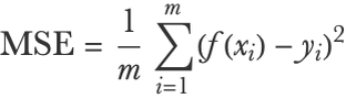
Here m is the number of examples in the test set, f(xi) is the prediction for test example i, and yi is the actual value of example i. This measure is also used to train models (see Chapter 5, How It Works).
We can also take the square root of the mean squared error to obtain the root mean squared error:
This would be written as follows:
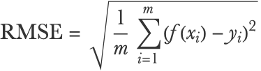
The root mean squared error is more interpretable than the mean squared error because it corresponds to the typical magnitude of the residuals. In this case, a value of 4.3 makes sense since most residuals lie in the -5 to 5 range. This measure is sometimes referred to as the standard deviation, although it is not exactly the standard deviation of the residuals because they are not centered:
Okay, so is 4.3 a good root mean squared error? As usual, it is application dependent, but the first step is to compare it with the typical values in the test set. For example, we can compute the standard deviation of the true values, which is 9.6:
This means that true values typically deviate by about 9.6 from their mean while the predictions only typically deviate by about 4.3 from the truth, so we can say for sure that our model is using the information given by the features. Otherwise, the root mean squared error would be around 9.6 (which corresponds to always predicting the mean). A way to quantify this better is to compute the coefficient of determination, which is denoted R2 and is pronounced R squared:
This can be interpreted as the fraction of variance explained by the model. In this case, about 80% of the variability of the price is thus predicted by the model while the remaining 20% of the variability is unaccounted for and is considered noise from the perspective of the model. A model that always predicts the mean would have an R2 of 0 while a perfect model would have an R2 of 1. Root mean squared error and R2 are the most popular metrics to report the performance of regression models.
Prediction Scatter Plot
Let’s now analyze the performance of this model in more detail. To do this, we use the function PredictorMeasurements on the model and the test set:
One useful way to analyze the performance of a regression model is to make a scatter plot of the true values as function of the predicted values:
Each data point corresponds to a test example here. If the model was perfect, every point would lie on the diagonal (and the R2 would be 1). If the model was very poor, we would see points everywhere (and the R2 would be close to 0). As is often the case, we see a middle-ground situation, and points are distributed around the diagonal with some deviations (note that horizontal deviations from the diagonal correspond to the residuals).
This scatter plot is useful to see, for example, if small values are better predicted than large values or if some small/large values are typically overestimated or underestimated. Overall, it gives a sense of how wrong the model can be. Note that this visualization is very similar to a confusion matrix and we can use it as such to extract particular test examples. We can, for example, extract examples whose true values are between 10 and 20 while their prediction is between 0 and 10:
This can be useful for understanding why some examples are misclassified.
Likelihood
The likelihood can also be defined for regression models; we just need to use probability densities instead of probabilities.
Let’s first compute the predictive distribution of every test example:
We can now compute the probability density of these distributions for the actual value:
The likelihood is the product of these probability densities:
This number is rather small (and can easily be too small to be represented with 64-bit real numbers), so as for classification, we generally compute the log-likelihood instead, which is best computed by summing the log of the probability densities:
We can also compute the negative log-likelihood (a.k.a. mean cross-entropy or log loss):
As for classification, this measure can be written mathematically:
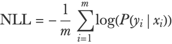
Here xi and yi are the input and output of example i, m is the number of examples, and P is the predictive distribution.
The likelihood and its derivatives are not so much reported for regression problems. One reason is that it is not a very interpretable measure. It is used to train regression models though, often implicitly. For example, if a regression model returns normal distributions (Gaussians) that always have the same standard deviation (an homoscedastic noise assumption), then maximizing the likelihood is equivalent to minimizing the mean squared error.
We defined the likelihood for classification and regression, but as we can see from the formula, this measure can be extended to any probabilistic predictive model P(yx).
| ■ | Regression is the task of learning to predict numeric values. |
| ■ | Input examples can be of any data type. |
| ■ | Regression models can generally return a predictive distribution that represents their uncertainty. |
| ■ | Regression problems can be transformed into classification problems by discretizing output values. |
| ■ | Good practices to create classifiers also apply to regression models. |
| ■ | Mean squared error and R2 are the main regression measures. |
| numeric variable | variable whose values are numbers or numeric quantities | |
| regression | task of predicting a numeric variable | |
| predictive distribution | probability distribution representing the belief of a regression model about the label of a given example input | |
| confidence interval | interval inside which a regression model is confident that the true label value lies, up to some given probability | |
| homoscedastic noise | noise/uncertainty whose magnitude does not depend on the input value | |
| heteroscedastic noise | noise/uncertainty whose magnitude depends on the input value | |
| unimodal distribution | probability distribution that contains only one local maximum | |
| multimodal distribution | probability distribution that contains many local maxima | |
| discretizing a variable | transforming a numeric variable into a categorical variable | |
| ordinal regression ordinal classification | classification while taking into account a class ordering (e.g. “high” > “medium” > “low”) | |
| log transformation | replacement of numeric variables by their logarithm, used to process data spanning several orders of magnitude | |
| causal model | model that describes the causal mechanisms of a system, can be used to predict the consequences of an intervention (e.g. changing the value of a variable) in the system |
| residuals | differences between predictions and true values for a given dataset | |
| mean squared error | mean of the squared residuals | |
| root mean squared error | square root of the mean squared error | |
| coefficient of determination R2 R squared | fraction of variance explained by the model, computed from the mean squared error and the standard deviation of the label values | |
| likelihood | product of the probability densities attributed to correct label value | |
| negative log-likelihood mean cross-entropy | opposite of the log-likelihood per number of examples |