심장병 데이터 분석
데이터 분석은 미가공 소스에서 검색 한 정보 기반에서 추출, 표시 및 모델링을 실행하는 과정입이다. 이 예에서는 Wolfram 언어를 사용하여 데이터 분석을 수행하는 작업의 흐름을 보여줍니다. 여기에서 사용된 데이터 집합은 1541명 환자의 심장 질환 진단 데이터로서 UCI Machine Learning Repository에서 가져왔습니다.
심장병 진단 데이터를 가져와 각각의 행이 환자 각각의 열과 상응하고, 다양한 특성에 대응하도록 데이터 구문을 분석합니다.
In[1]:=

rawdata =
  Import["https://archive.ics.uci.edu/ml/machine-learning-databases/\
heart-disease/new.data", "Text"];
data = StringSplit[rawdata, LetterCharacter ..];
data = Table[
   ToExpression[StringSplit[dat, (" " | "\n") ..]], {dat, data}];
관련있는 특성을 "labels"과 "features"로 추출합니다. "labels"에 담긴 값은 0과 1이며, 각각 심장병의 존재와 부재에 대응합니다.
In[2]:=
labels = Unitize[data[[All, 58]]];
features =
  data[[All, {3, 4, 9, 10, 12, 16, 19, 32, 38, 40, 41, 44, 51}]];
In[3]:=
Take[labels, 10]Out[3]=
각각의 환자에 대한 특징은 벡터 숫자의 목록으로 나타냅니다. 그러나, 데이터는 완전하지 않으며, 결손 가치는 -9로 저장됩니다.
In[4]:=
features[[-3]]Out[4]=
결손 가치는 해당 특성에서 사용 가능한 데이터의 평균으로 대체하고, 다양한 특성 간의 상관 관계를 시각화합니다.
In[5]:=

features = Transpose[Table[
N[attribute /. {-9 -> Mean[N[DeleteCases[attribute, -9]]]}]
, {attribute, Transpose[features]}]];
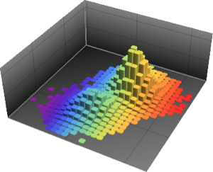
cormat = Correlation[features];전체 Wolfram 언어 입력 표시하기
Out[6]=

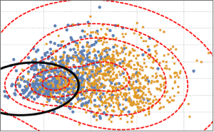
데이터 분포를 시각화하기 위해, PCA를 실시하여 2개의 주요 구성 요소를 추출하고 투영 된 데이터를 분산형으로 나타냅니다.
In[7]:=
pcs2 = Take[PrincipalComponents[features, Method -> "Correlation"],
   All, 2];
전체 Wolfram 언어 입력 표시하기

Out[8]=

두개의 클래스를 구별하기 위해 투영 된 데이터를 2개의 구성 요소로 된 가우스 혼합 모델에 피팅합니다.
In[9]:=

edist = EstimatedDistribution[pcs2,
   MixtureDistribution[{p1,
     p2}, {BinormalDistribution[{m11, m12}, {s11, s12}, r1],
     BinormalDistribution[{m21, m22}, {s21, s22}, r2]}]];
혼합 모델을 기반으로하여 혼합 모델의 결정 경계 (검정 곡선)와 확률 밀도 등고선 (빨간 곡선)을 플롯 산점도에 분산형으로 겹쳐 표시합니다. 가우스 혼합 모델의 첫 번째 구성 요소는 결정 경계 안에서 더 높은 확률을 가집니다.
전체 Wolfram 언어 입력 표시하기

Out[10]=